In the vast world of typography, few trends have proven as influential and enduring as the dominance of sans serif fonts. From minimalist branding to cutting-edge websites, sans serif typefaces have become the go-to choice for modern designers. But what is it about these clean, unadorned letterforms that gives them such a commanding presence in design? The answer lies in a combination of aesthetics, functionality, and evolving cultural preferences.
Simplicity and Modern Appeal
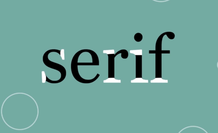
Sans serif fonts are characterized by the absence of decorative strokes or “serifs” at the ends of letters. This simplicity is a significant reason for their popularity. In an era where clarity and speed are paramount, the clean lines of sans serif fonts provide an immediate, uncluttered reading experience. This aligns with modern design principles that emphasize minimalism, whitespace, and a “less is more” philosophy.
Designers favor sans serif typefaces like TT Norms Pro because they exude a sense of modernity and professionalism. The geometric precision of many sans serif fonts complements the sleek interfaces of digital environments. Whether it’s a tech company’s logo or a mobile app’s UI, the aesthetic appeal of sans serif fonts resonates with contemporary audiences seeking clarity and sophistication.
Digital Readability
The rise of digital media has further accelerated the preference for sans serif fonts. On screens—especially smaller ones such as smartphones and tablets—sans serif typefaces tend to be more legible. Their straightforward structure makes them easier to read at various resolutions and screen sizes, which is crucial in an age where content must adapt to countless formats.
While serif fonts have long been favored for printed materials due to their readability in long-form texts, sans serif fonts are better suited for short bursts of text, such as headlines, UI elements, and digital ads. Their adaptability to digital interfaces has made them indispensable in web design, where user experience and accessibility are top priorities.
Versatility in Branding
One of the key reasons sans serif fonts dominate design is their versatility. They can convey a range of emotions and brand personalities depending on their weight, spacing, and use of color. A bold sans serif font can communicate strength and confidence, while a lighter version can suggest elegance and simplicity.
Brands across industries—from tech giants to fashion houses and media companies—have embraced sans serif typefaces in their visual identities. These fonts offer a neutral yet strong voice that allows the brand’s message to shine without distraction. The flexibility of sans serif fonts makes them a safe yet impactful choice for branding, capable of adapting to different tones and contexts.
Evolution of Taste and Trends
Over the past few decades, there has been a shift away from ornate, decorative styles toward more minimalist and functional design. Sans serif fonts are a reflection of this cultural shift. Their dominance is not only about aesthetics but also about aligning with broader societal values of transparency, simplicity, and inclusivity.
Designers are also more globally aware, and sans serif fonts often transcend language and cultural barriers more effectively. Their neutrality can be seen as inclusive, making them suitable for international branding and communication in a globalized world.
Conclusion
Sans serif fonts dominate modern design because they meet the needs of today’s visual and functional landscape. Their clean lines, digital readability, and versatile nature make them ideal for designers seeking clarity, elegance, and contemporary appeal. As design continues to evolve alongside technology and cultural shifts, sans serif typefaces are likely to remain at the forefront, not because they are trendy, but because they are timeless in their utility and aesthetic power. Whether on a billboard or a smartwatch, their message is always clear: simplicity is sophistication.

